本文是由濟南包裝設(shè)計公司轉(zhuǎn)發(fā)英國設(shè)計周新聞資訊,因濟南包裝設(shè)計公司小編不會英文,所以文章用翻譯軟件直譯:
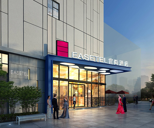
 注:配圖為本公司作品
For many of us growing up in the eighties and nineties, Toys R Us was a cornerstone of childhood, where hours of fun would be spent scouring the aisles for board games, cuddly toys and dolls and action figures that adhered to appalling gender stereotypes.
However, online retail giants such as Amazon, plus the growth of trendier, boutique toy shops have since taken over the market, with more up-market stores like John Lewis acting as a preferable half-way house. And so giant, colourful, toy megastores like Toys R Us started going out of fashion.
Toys R Us first filed for bankruptcy in the US and Canada in September 2017 – by March this year, it had closed 25 of its UK stores and it has now closed all its 100 UK-based stores. Its online store has since also closed down.
Prior to going into administration, design consultancy Lippincott was commissioned to give the company a rebrand, in a bid to bring it back to life and help it compete against the increasing number of online giants it was floundering against.
The project encompassed a new look that aimed to unify Toys R Us and sub-brand Babies R Us, and was completed in a speedy three months, but the branding never saw the light of day.
“The goal of the rebrand was to bring play to life and recapture the original purpose of the Toys R Us brand,” Brendán Murphy, senior partner at Lippincott, tells Design Week. “When a brand is this iconic, it runs the risk of becoming a caricature of itself. So we wanted to add depth and emotion to it, through reclaiming ‘play’ as unstructured and imaginative. For Babies R Us, we used the concept ‘Prepared-ish’.”
The new brand was created focused on the well-known, backwards “R” letterform that features in the brand name. This was turned into a series of shapes, animals and animations, and given many different material forms and colours – rather than ditching the symbol for an entirely new one, as it “personifies the whole idea of play”, says Murphy and is so aligned with the company.
Lippincott also kept the toy store’s beloved mascot, Geoffrey the Giraffe, incorporating him into the redrawn R-shape and using him alongside a suite of other animal mascots, including crocodiles, elephants and monkeys.
A bright colour palette of green, blue, orange, yellow, pink and purple was used for Toys R Us, while Babies R Us was given a more subdued purple, pink and blue palette, as the sub-brand was aimed at “been-there-before parents” rather than kids themselves, says Murphy.
A series of animations and gifs were also created, which played with the “R” symbol and looked to make it more engaging for online purposes.
The tone of voice for Babies R Us also aimed to reflect a “more realistic view of parenting”, based on the concept of “Prepared-ish” to bring a more humanised feel to the brand.
Both brands were given the same, simple, sans-serif typeface, and the “R” symbol was reimagined for both, in a bid to connect the two brands.
While colourful and playful to be enticing for kids, the rebrand ultimately was targeted at enticing “millennial” parents, and encouraging them to buy based on nostalgia rather than convenience, in the case of giant online retailers, or rather than luxury and high-end products, in the case of boutiques.
Whether the new brand could have helped to boost sales for Toys R Us, or even save the store chain, is unclear, as it went into administration before the new identity could launch. But it is an interesting case study into how a retro brand could be modernised without losing its best-known features.
For Lippincott, although the team’s work never made it, it was not three months wasted, Murphy says. “It was a huge learning experience, and gave us the opportunity to relive and reimagine our childhoods,” he says. “We had a lot of laughs about what it was like to raise our own kids.”
Murphy adds that design alone could not have saved the company. “Design can help focus the brand purpose and engage people in its story, by creating an emotional impact – but this needs to build on a concrete business strategy delivered through a [unique] experience,” he says.
Although the rebrand did not beat the clock, the creative work that Lippincott produced does demonstrate how an old-hat brand can be updated – whether it would have been successful, we’ll never know.
Lippincott did not confirm with Design Week whether the design consultancy was paid for the branding work.
業(yè)務(wù)咨詢 付小姐
業(yè)務(wù)咨詢 舒先生
總監(jiān)微信咨詢 付小姐